
BRAND IDENTITY
The Six-Legged Dog: Eni's brand identity and history
The Eni logo has always been a visual symbol of our values and reflects a constant search for new possibilities.
The dog in our logo walks confidently and elegantly on the horizon of the contemporary, making a name for itself through the originality of its design. It has always supported Eni through an industrial evolution that is first and foremost a transformation of thought and action. Six legs to move us faster towards the energy transition and project us towards a more sustainable future, guided by two main values: vitality and practicality.

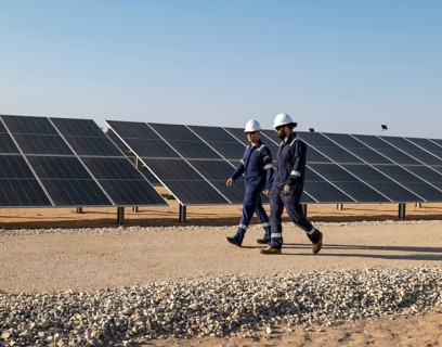
The demand for energy is increasing and Eni is responding with the creation of retail-oriented satellite companies that are able to respond effectively to market demands and opportunities. The corporate branding system translates this positioning into a concise and visual communication poster, with the young six-legged dogs of Plenitude, Enilive and Versalis.
From the rebranding process that started in 2022, new logos were born that, with different colours and graphics, represent the new businesses related to the energy transition. The new brand architecture aims to make vehicles of identity and information of our symbols which together tell a visual story of Eni's transition strategy. A sunlit green dog for Plenitude expresses the growing commitment to renewable energy sources; a blue shade and a stylised “turn" replacing the flame that represents Enilive’s contribution to the evolution of mobility towards the energy transition; a chain of polymers to show Versalis’ circular chemistry. This is how the new brands become a varied and coherent architecture of logos that, while dialoguing cohesively, express the diversity of the company’s activities.
The three companies, with their increasingly independent operations, reflect our satellite model idea, with the aim of fast tracking the development of new, high-potential businesses sitting alongside the more traditional ones.
Enilive service stations change their look: the rebranding in blue starts from Turin and Sanremo (only Italian version)
Our company dedicated to products and services for evolving, flexible and innovative mobility.
Renewable energy in Italy and worldwide, retail and e-mobility.
Circular chemistry that contributes to the energy transition.
The six-legged dog tells the story written in the future about a company that is always looking to change and constantly striving for innovation. In our logo we have many legs (actually six of them) to continue and push us faster on our journey towards decarbonization. With the courage to constantly revamp ourselves.
Due to its simplicity and, at the same time, complete originality, the six-legged dog stood out among over 4,000 sketches in a competition organized in the spring of 1952 by Enrico Mattei himself, Eni’s Founder and first Chairman. In 1953, the trademark was filed at the Patent Office in Rome and became the symbol of the Ente Nazionale Idrocarburi (National Hydrocarbons Agency), founded in the same year. Ever since the 1950s, it has continued to be the hallmark of Italian energy.
The logos of Enilive, Plenitude and Versalis were born, new colours and graphics to express the most innovative businesses related to the energy transition.
In the revamped version of the brand, the dog stands halfway out of the yellow box to symbolise and endorse a brand that is constantly evolving.
Simple, yet full of meaning and strength, the new brand combined the dog with the Eni logo in a single space to reinforce the Group’s cohesion.
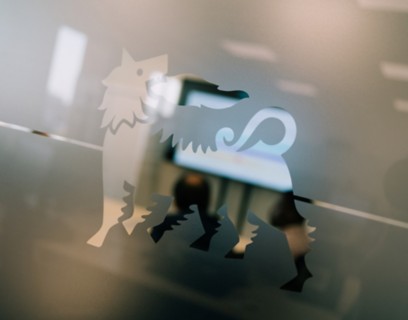
A less ferocious and more familiar dog was redesigned by Bob Noorda, to become a real brand framed within a shape for advertising applications.
Broggini, the sculptor, was the inventor of Eni’s logo: “a six-legged animal resembling a dog, facing to the left of the viewer, but with its head looking backwards”.
1952. The original logo designed by Luigi Broggini under the pseudonym Giuseppe Guzzi.
1972. The first restyling entrusted to Unimark Graphic Studio and designer Bob Noorda.
1992. When Eni was privatised, Bob Noorda was approached again.
From 2010 to now. The brand thus becomes the synthesis and frame of every 'vital organ' of Eni.
1952. The original logo designed by Luigi Broggini under the pseudonym Giuseppe Guzzi.
1972. The first restyling entrusted to Unimark Graphic Studio and designer Bob Noorda.
1992.When Eni was privatised, Bob Noorda was approached again.
From 2010 to now. The brand thus becomes the synthesis and frame of every 'vital organ' of the company.
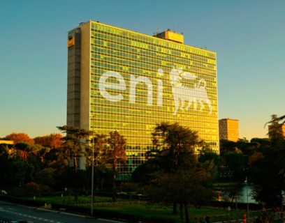
Today, the unmistakable dog has been walking alongside Italy for more than 70 years while maintaining its original trajectory: a tension towards the future, in a world undergoing deep transformation.
Enrico Mattei himself wanted a competition of ideas and an authoritative jury to build Eni's logo in 1952.
Great personalities took part, such as Armando Testa and Fortunato Depero, but it was Luigi Broggini, a great sculptor who registered under a pseudonym out of intellectual modesty, who invented the Six-Legged Dog. Inspired by a child playing with a six-legged dog, this logo represents friendship, loyalty and strength, but also projection into the future.
Unimark graphics studio and designer Bob Noorda were tasked with redesigning the brand image in 1972. With the first makeover, the Six-Legged Dog, which was already deeply rooted in the Italian collective imagination, became a brand in its own right: shorter, less slanted and framed within the ‘signage', the petrol station sign. The fangs disappeared and the crests became less pronounced. The lettering was also revamped, with a white border making it more noticeable and readable from a distance. As Noorda himself stated, the new logo was created to avoid “everything smelling of petrol”, i.e. to separate services for cars from those for humans.
Bob Noorda was again involved for a second makeover of the logo in 1998, after the transformation from Ente Nazionale Idrocarburi into a joint-stock company. The need to express such a different business organisation led to the Dutch designer's graphic design: the dog, made even smaller to follow the length of the logotype, “fits” into a square area together with the word Eni. An essential solution, but one of great strength and impact, confirming the value of the group's unity, even with the addition of the word “group” later on.
More slender and dynamic, in the makeover carried out by Inarea in 2009 the Six-Legged Dog “comes out” of the yellow area to move freely in space. As a continuation of its first design, he increased the vital and energetic force of the logo to express the evolution from an oil company into an integrated energy company: active across multiple sectors, but able to coordinate them all and express itself through one name and one brand.
From 2010 to 2014, Eni embarked on a memorable communication journey through more than 200 creations created by 150 young talents from all over the world, including designers, performers, illustrators, musicians, street artists and photographers.
Between 2022 and 2024, with the birth of the new companies specialising in the businesses most related to the energy transition, Enilive and Plenitude, a new brand architecture is being defined, which also involves Versalis, the group's chemical company. The Six-Legged Dog multiplied and took on new green and blue colours. More importantly, the flame was replaced by elements specific to the individual group companies: the sun for Plenitude to symbolise renewables, the road as an image of mobility for Enilive, polymers for Versalis as a symbol of plastics recycling.

1970s, Raffaella Carrà endorses the Agip campaigns.

1970s, Raffaella Carrà endorses the Agip campaigns.

1960s, “Corre giovane chi corre Agip” campaign.

1960s, “Corre giovane chi corre Agip” campaign.


From June 18 to July 28, 2024, the Sala Fontana hosted an exhibition on the evolution of Eni's brand.

The Six-Legged Dog in blue with the stylised road is the symbol of Enilive, the company dedicated to mobility with a customer-focused approach.


 Download document
